Best 8 UI/UX Trends for Successful E-commerce Sites

Image from Unsplash
Today, e-commerce sites are constantly developing at a rapid pace. As recent statistics showed, over two billion buyers and sellers prefer to shop online, and e-retail sales surpassed 4.2 trillion U.S dollars worldwide.
E-commerce organizations are looking for innovative and bolder strategies to stay competitive in the e-commerce space. E-commerce is not what we used to think of when converting a customer was way easy due to low competition. With time and increased competition, it has become challenging to turn users into purchasers.
To remain competitive in the e-commerce market, brands are adopting intriguing website designs. E-commerce UX And UI design are not about creating a website with innovative shopping ideas, but with the latest trends, it also leaves a lasting impression on the customer experience
As a result, to strive for world business, significant updates are being introduced in the e-commerce UI/UX design. And the designers are looking to bring an engaging, convenient, and satisfying online shopping experience to customers. It is important to consider these e-commerce UX and UI designing tips to gain the momentum of constantly evolving buyers' journeys.
8 Trending UX And UI Designing Hacks For E-Commerce Website Owners
1. Use A Secure Server
Remember that the customers are always the first and foremost choice to be considered. Successful e-commerce UX/UI design creates an ease of physical shopping without making them feel that they are compromising just because they are doing it online.
If your website is not trustworthy, then shoppers simply choose to go elsewhere. Some trusted companies add SSL (secure sockets layer) certificate authentication.
These are the servers that use the secure sockets layer protocol. They are supposed to protect communication from unintended recipients by focusing on the protection of resources and data present on the server.
This step assures the shoppers that their data is secured by implementing an SSL certificate badge. Moreover, users can see a lock sign along with the domain name, which indicates that the website is safe and secure.
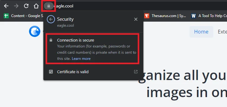
A website without SSL can create a sense of zero trust and nervousness among the users. A not secure sign is shown at the top, which says that the website is not secure to use.

2. Add Visible Call-To-Action
If your business operates an e-commerce website or drives traffic to get more sales, then an effective call-to-action button boosts more sales and drives revenue. Having a clear CTA on the right pages keeps the customers engaged in what they directly do while on your website.
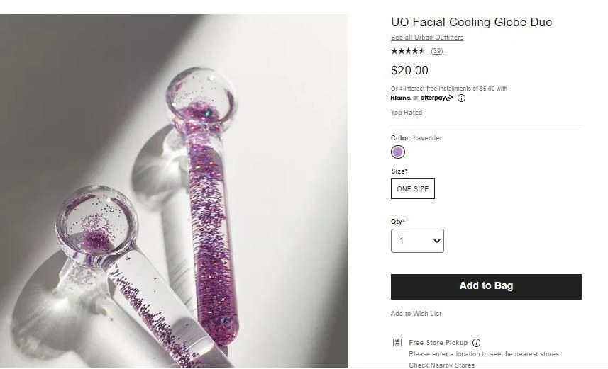
Image from Urban Outfitters
Every online business uses CTA to interact with daily customers from the product page to the home page. Phycology says having CTA across e-commerce websites plays a time factor role like "shop now" adds more curiosity because people respond to urgency and scarcity, and this compels the customer to make the action in the particular instance.
Let's have a quick look at some amazing CTAs and how they work in the e-commerce industry.
CTAs To Ask Your Customer To Buy
- Buy now - a simple classic CTA
- Complete my purchase - CTA for the final step of the buying process
- Treat yourself today - an emotion-focused CTA
- Grab it today - good for low-cost products and create a sense of urgency as well
- Try out today - if you offer generous return policies, this is a great one
- Get the look - CTA specifically for fashion stores
- Buy now to avoid disappointment - creates urgency and is best for risk-averse customers
- Buy now and enjoy {add a feature} - a positive CTA that focuses on user benefit
- Choose the perfect look for you - a CTA emphasizing the choice, perfect for the fashion brands
- Get one today and see instant results - a simple cause and effect statement
CTAs To Get Customers Claiming A Discount
- Save big - almost all customers look for discounts
- Claim the exclusive offer - a CTA that creates a sense of, well, exclusivity
- Get my discount - a personalized, simple example of a discounted CTA
- Claim free shipping now - works best if you have local customers
CTAs To Ask Your Customers To Subscribe
- Sign me up - a simple CTA with a personalized message
- Subscribe now - a simple yet classy CTA used globally for subscriptions
- I'm in - a highly customized CTA to create a sense of personal involvement
- Join the action - offer a sense of being a part of something
- Join the {brand name} community - works best for joining a group or community
- Be part of our growing community - to connect with a trending and like-minded community
- Sign up now to claim exclusive discounts - a simple phrase that combines both scarcity and urgency
CTAs To Get Customers Look For More
- Find out more - a simple CTA, an improved version of 'learn more'
- Discover more - creates a sense of adventure and exploration
- Get the latest updates - best for keeping a customer up to date
- See it in action - works best for videos
- Take 2 minutes to see how it works - a CTA emphasizing how little effort can benefit you
CTAs To Get Customers Onto Your Free Trial
- Start your free trial - a simple CTA that adds a personalized touch
- Try it now - another classy CTA with a sense of urgency
- Join free for 1 month - a super informative and clear CTA
- Try out for free - a CTA emphasizing zero commitment
These are some examples of widely used CTAs.
3. Integrate Chatbots
In the era of technology, the only way to grab customer interest is to add a personal touch while interacting with them. In this framework, by integrating chatbots with artificial intelligence or machine learning, e-commerce players reduce the gap of personalization that online buyers face while shopping.
Although chatbots are the newest trend in answering customer queries, product descriptions, and instant messaging, now chatbots stimulate the customer's feelings and provide them insight into what is best working for them and transform their whole interest toward online shopping. According to statistics shared by Drift, 87.2 percent of users rate their chat with a bot within a range of neutral to positive, and chatbots have observed a growth of 92 percent since 2019.
Let's look at some of the reasons why chatbots have grown so fast and how they impact user experience.
Faster Response Rate
69 percent of consumers prefer to communicate with chatbots due to fast communication (LinkedIn). Chatbots respond to you within a second and can resolve up to 80 percent of queries.

Reducing Wait Time
While having a conversation on several websites, you may observe a waiting time. I personally have faced this issue with NameCheap and Payoneer customer support. Whereas, 59 percent of customers expect a response rate within 5 seconds. And a chatbot fulfils their expectations.
Provide Personalization
Chatbots can easily personalize a user experience. Have you ever tried talking to Google Assistant or Alexa? They can make you feel special. Similarly, you can design chatbots in a way that can provide a customized experience and satisfy your leads.

Staples, H&M, eBay, Peloton, Nike, Domino's Pizza, Lego, Levi's, Nivea, Sephora, and Casper are some prominent examples of e-commerce websites which are successfully using chatbots to increase sales and customer satisfaction.
4. Optimize Content With Smart Loading
Currently, online shopping and e-commerce are receiving great consideration. According to Pew Research Center Survey, the behavior of Americans has changed rapidly, and many of them incorporate smartphones or devices into their purchasing behavior.
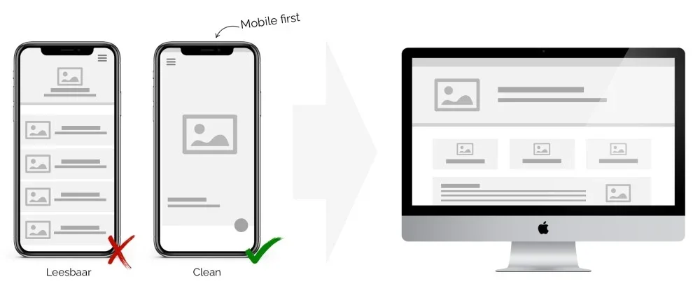
This means that UI and UX designers need to load smart content that is easy to operate and loads quickly, even on low-bandwidth networks. Research produced by Dissertation Assistance suggests lazy loading of the content and images only at the time of need. This will help to load the website on low-resolution devices.
5. Consider Content-Focused Design
Content should be well-focused, considering that the content is the king. If done properly, then it can surely act as an incredible tool to function. Leverage a content-focused approach to gain good website traffic. It will also help to build a reliable relationship with customers.
Content plays an important role in driving users to stay on your website and make a purchase. But, too much of content can create a dull look. Make sure that your message is clear but in a concise way.

The main focus should be on the area above the fold. This is the first interaction of the user with the website. You should display the most critical content here. And the rest could go below the fold.
Either you can keep your above-the-fold less crowded, as shown in the above picture. But you can also utilize it to showcase your hot products to increase sales.

Make sure that you do not overdesign. Limit your font's face, sizes and colors. It is imperative that your text should be clear and do not resembles your graphics. If the text looks too much like graphics, your user may consider it as an ad. Ensure that the text and the background colors are high-contrast; it will make your content much more clear.
Focusing only on the homepage or the above-the-fold area is not enough. You need to be careful about every single page on your website, and the content displayed there. This can range from the description on a product page to error message and confirmation emails, which create frictionless interaction and avoids frustrations for users to know what exactly they need to checkout.
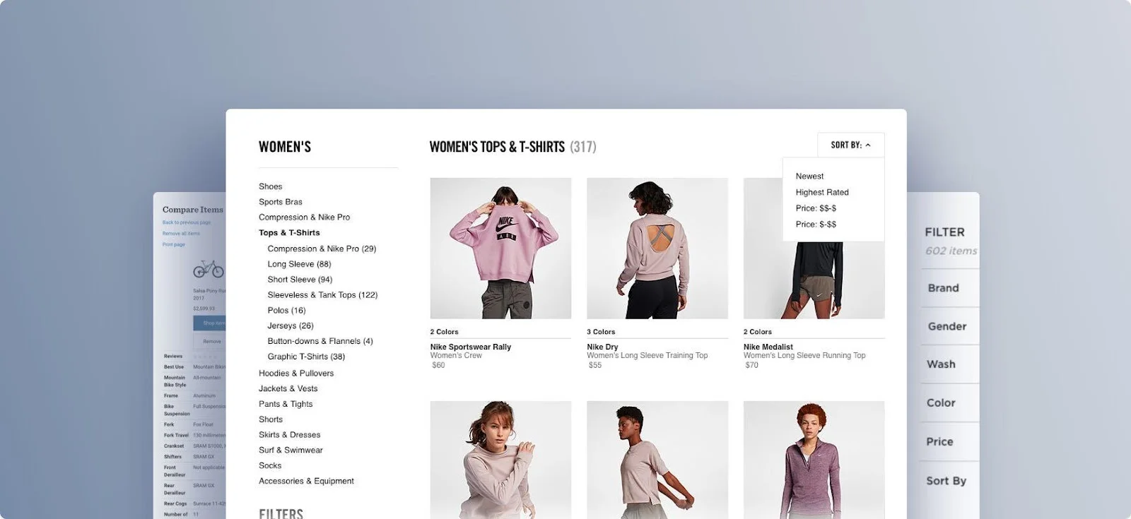
You should remember that the user will convert into a customer from your product page. It should be interactive and engaging.
6. Leverage Hyper-Creative Web Animations
Web animations are adding zest in many ways, with highly engaging visuals, including GIFS, cinemagraphs, and full-screen videos, which are introduced to the homepage. This animation usually lasts for no more than two seconds but conveys the complete message.
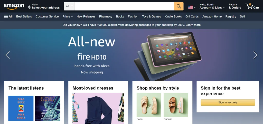
While most web designers use this effect to create a "cosmic effect", there are also those who leverage website animation to create an enjoyable customer experience, which makes them spend more time with a brand online. For example, micro animations are a great way to indicate the progress of a task, such as the loading of the page.
7. Use Simpler Navigation
Navigation prospects are meant to help people to find what they are looking for and finally take action. Moreover, it helps the user to pick the process more easily, with a click or a swipe.
We are used to seeing the navigation menu at the header, footer, left or right side of the website, but now it is placed at the center.

A similar strategy was used by Assignment Assistance, and they observed that their product search was increased by 350 percent, and average user spend time was boosted to double.
The e-commerce website design has started adding more animation, branding names, and images, which turn ordinary website navigation into a visual attraction. It brings a seamless shopping experience to customers to get deeper into brand style and value.
8. Provide Smooth Checkout Process
If your business strategy is not revolving around customers. Then by making faster customer checkout, you can easily leverage customer satisfaction. A streamlined checkout process, including a progress bar display, shows how many steps are left to complete the purchase. This will assure the shoppers that they are on the right track.
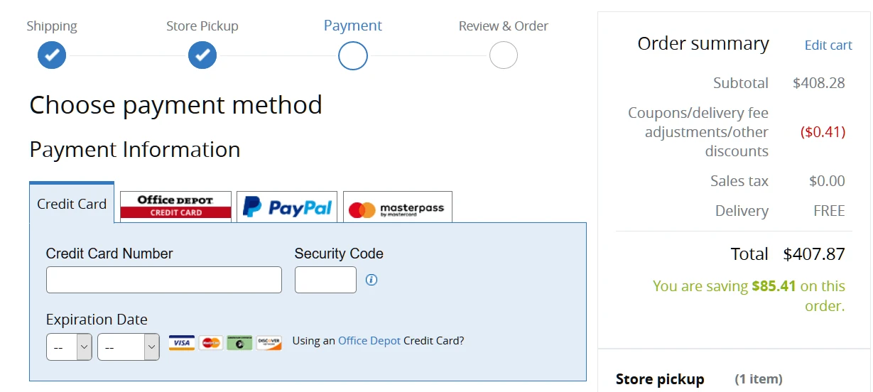
Image from The Good
Furthermore, by including a live chat or contact number throughout the checkout process, customers can easily get the answer rather than leaving the site or going elsewhere. This could also include quick payment gateways, which do not require much time.
Conclusion
It's all about driving customer engagement when it comes to e-commerce website design. It is about creating an online shopping experience that will convert passive customers to paying customers.
Leveraging UX and UI trending designs for e-commerce websites will help you to create a customer experience that is attractive and user-friendly. With this, you are easily going to hit the center of percussion, and surely you will have a windfall of customers. I wish you the best of luck with your future endeavors and designing a customer-centric e-commerce website.